
When to use Predict
Most organizations already collect valuable information — from how voters respond to your candidate, to who donates, unsubscribes, or signs up to volunteer. Hidden inside that data are patterns that can help you forecast how people you haven’t yet reached might think or behave. That’s where Matchbook Predict comes in.
With Predict, you can upload your own data and automatically build a custom predictive model that estimates the likelihood of a person taking a particular action. Common examples include:
- Field or canvass IDs (e.g., “support,” “oppose,” or “undecided”)
- Polling results
- SMS opt-outs or email unsubscribes
- Donation amounts or giving levels
A good model needs enough data to learn from. To train a Predict model, you need to import at least 1,000 voter-file-matched records with reasonable variation in your outcomes (exact requirements vary depending on the size of your list). If every donor in your list gave roughly the same amount, the model won’t have much signal to learn what differentiates them. In that case, you might be better off using our Lookalike tool, which expands an existing list instead of predicting new behavior.
How to get started
To train a model, upload a CSV of people and include an extra column for the value you want to predict. That column should contain numeric data and will fall into one of two categories:
- Binary – Values are only 0 or 1.
- Example: supporter (1) vs. non-supporter (0)
- Example: opted out (1) vs. still subscribed (0)
- Continuous – Any numeric value along a range.
- Example: donation amounts ($5–$500)
- Example: number of events attended
Your data should include the full range of responses — both affirmative and negative — so the model can learn what distinguishes one from the other.
When not to use Predict
Predict works best for outcomes that are political or behavioral in nature — things that correlate with the hundreds of features already available in the voter file.
It’s not designed for topics completely unrelated to politics (like “Coke vs. Pepsi” preferences), and it won’t add value if your outcome variable is something the voter file already explicitly contains.
For example, suppose you try to predict party registration by labeling Democrats as 1 and Republicans as 0. In that case, the model will simply rediscover that field — producing perfect metrics for all the wrong reasons. (If your evaluation metrics look too good to be true, they probably are.)
How the model is trained
Since no specific pre-programed model architecture or feature set is likely to perfectly fit each audience, we train dozens of unique models using a range of approaches. First, we build hundreds of random forest models to generate a variety of high quality feature sets. We then use those features in a grid search across 80,640 unique deep learning architectures with unique combinations of values across 9 different hyperparameters. Each resulting model offers a unique perspective on what defines your source audience, capturing different patterns and interactions within the data.
We then select the model that performs best across a series of metrics. The model our system selects may not be the best-performing on any specific metric, but it should be the best when weighing all the metrics together.
How to tell if your model is good
Every model comes with some uncertainty, but we try to make it easy to understand how well yours performs. You’ll see a few key metrics and charts in your model library:
Metrics
- Gain captured – Evaluating the model’s effectiveness at distinguishing between those most likely and least likely to be in your target population.
- >0.7 = strong
- 0.3 – 0.7 = usable but moderate
- < 0.3 = weak (random is 0)
- Mean absolute error (MAE) – Measures the average difference between actual and predicted values. The value here will depend on the scale of the value you’re predicting; for example, for donation amount, this value represents the distance between the predicted and actual donation amount in dollars in the testing data our system set aside during training.
- Area under the ROC curve (AUC) (binary only) – Assessing the model’s ability to distinguish between 0s and 1s in your list. Rule of thumb:
- 0.75 = strong
- 0.6 – 0.75 = solid but mixed
- 0.5 = random guessing
Charts
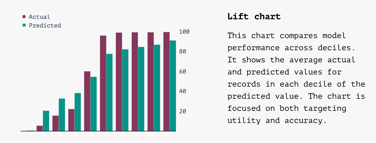
- Lift chart –
- A good lift chart will have a steep slope with values in the first column close to zero and values in the last column close to 100 with predicted values tracking close to actual values
- A bad lift chart will be flat with big differences between actual and predicted values
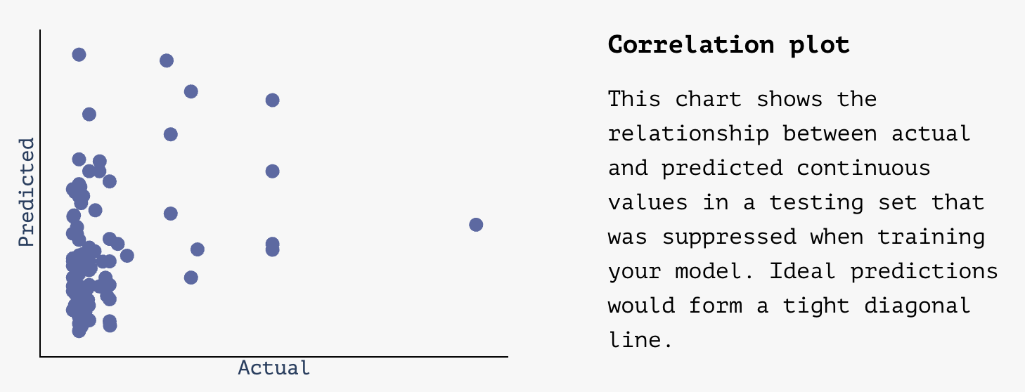
- Correlation plot (continuous) –
- A good correlation plot will have points plotted in a relatively tight diagonal line, showing predictions that get close to actual values
- A bad correlation plot will look pretty random without a clear central diagonal line
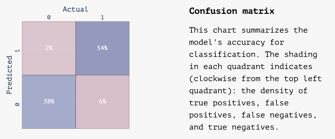
- Confusion matrix (binary) –
- A good correlation matrix will have the majority of values in the top right and lower left quadrants of the matrix representing 0s and 1s that were correctly identified by the model
A bad correlation matrix will have a more even distribution across the four quadrants with a lot of false negatives and false positives
Using your model
Once your model is trained, you’ll find it in your Model Library inside Matchbook. From there, you can:
- Create new audiences using the Filter tool to build your list (e.g., “top 10% most likely to donate $100+”).
- Export lists with Predict scores appended for use in ads, mail, or texting tools.
Why this matters
Predict takes the heavy lifting of machine learning — data prep, feature selection, architecture tuning, and evaluation — and wraps it into a straightforward workflow anyone can use.
Whether you’re a campaign manager exploring modeling for the first time or a data scientist who usually spends days tuning hyperparameters, Predict gets you from dataset to deployable model in minutes.